SEDD Design Pre Approval
 Sharjah Municipality Parking Reservation Approval
 RTA Pre Approval
 Government of Ajman
 DESIGN & APPROVAL
 OUTDOOR & INDOOR BRANDING
 SIGNAGES
 VEHICLE BRANDING
 FLAGS & BANNERS
 OTHER SERVICES
Key takeaways
- Contrast, not colour, drives legibility — the difference between text and background matters more than the hues themselves.
- Deep, saturated backgrounds beat pale ones under a bright Gulf sky; thin strokes and pastels wash out in daylight glare.
- Test artwork lit and unlit — colours shift under LED, thin type blooms, and heavy backgrounds can go muddy at night.
- Keep it to six words or fewer, one idea, maximum contrast — that is the formula that reads at 100 km/h.
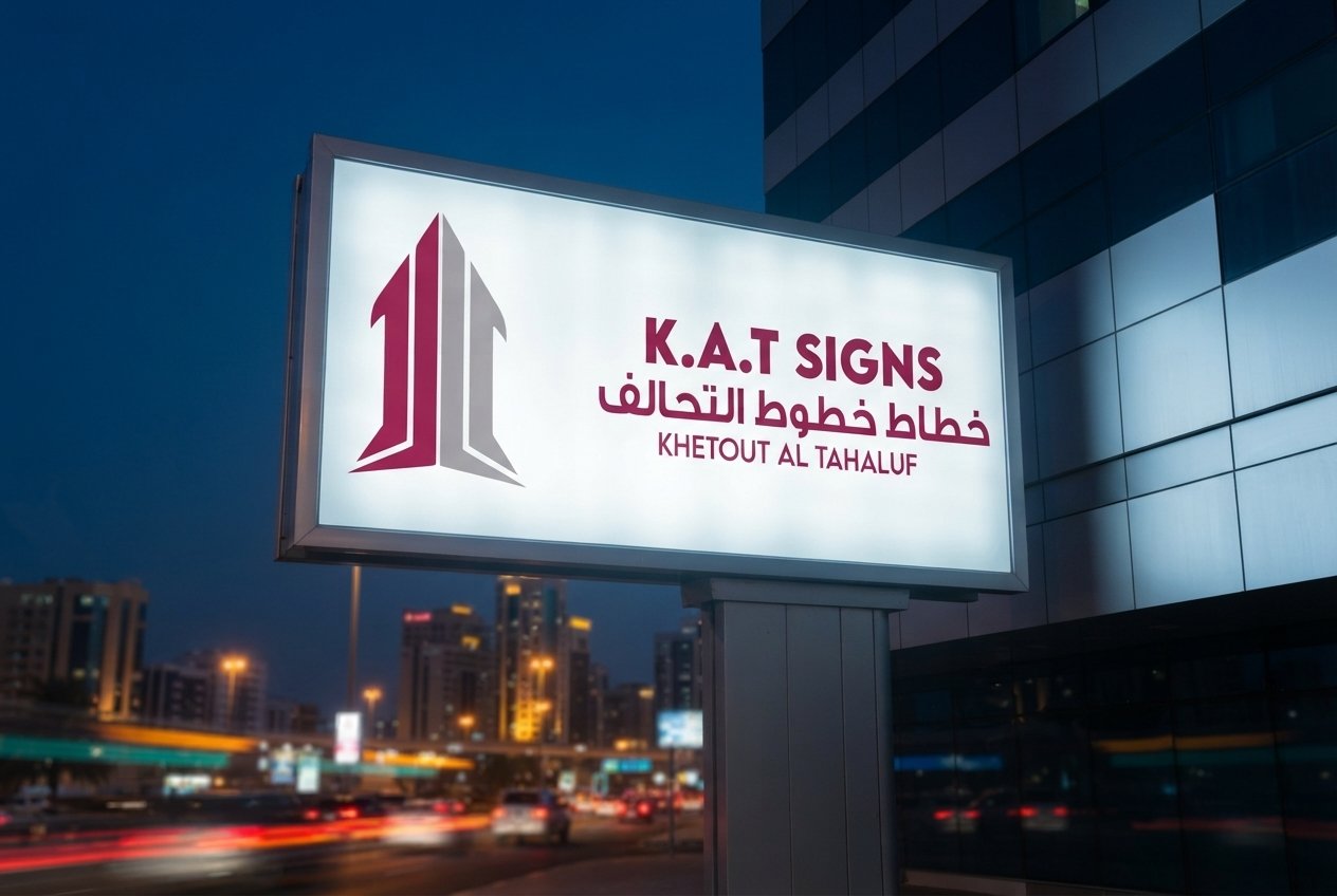
The most expensive billboard mistake is not a typo — it is low contrast. A board that looks fine on a laptop can vanish against a bright UAE sky or a dark night highway. Here is how to make colour work at 100 km/h, by day and after dark.
Does colour or contrast make a billboard legible?
Contrast makes a billboard legible, not colour — legibility is about the difference between the text and its background, not the hues you choose. Dark text on a light field, or bold light text on a deep field, reads from far further away than two mid-tones sitting side by side. If your brand colours are close in tone, the message will blur at distance no matter how on-brand it looks up close. The fix is to force separation: add an outline, a knockout panel or a drop shadow so the type stays distinct even when two brand colours are tonally similar. Design for the difference between elements, and the colours can be whatever the brand needs.
What colours work best on a billboard under the Gulf sky?
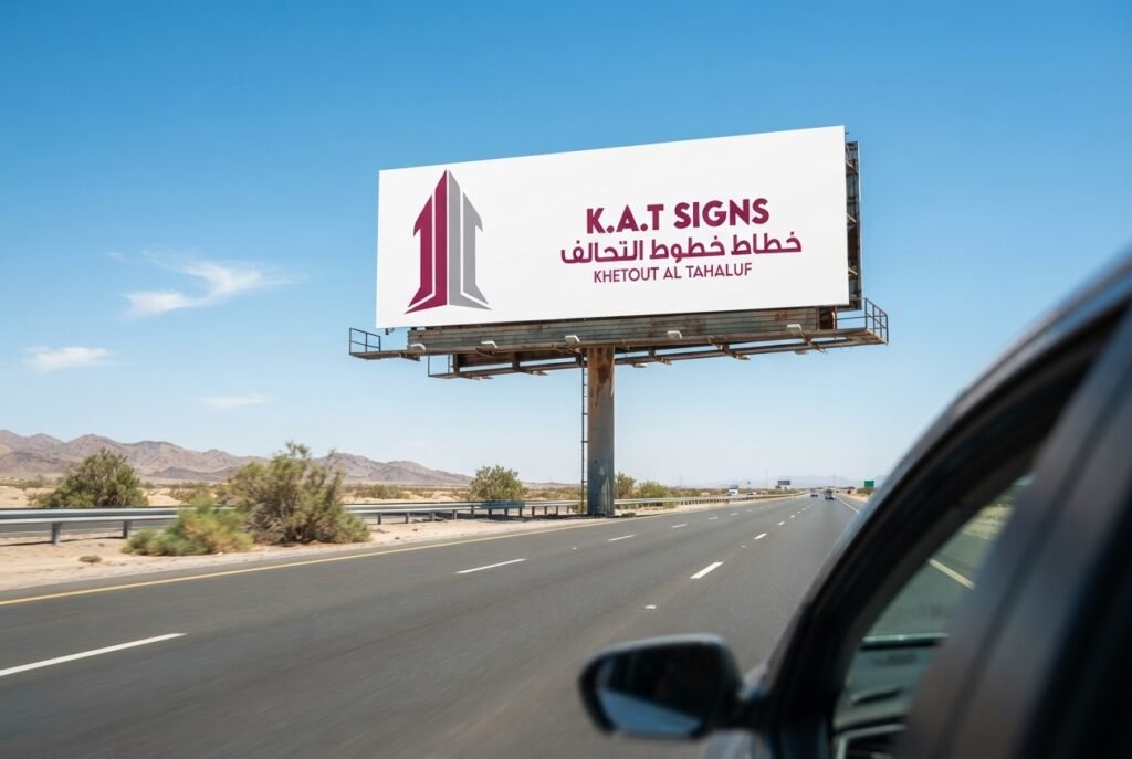
Deep, saturated backgrounds with bold, high-contrast type hold up best under a bright, hazy Gulf sky, because pale colours and thin strokes wash out in daylight glare. A rich, dark field gives the light-coloured headline something to push against; a washed-out pastel gives it nothing, and the whole board fades into the haze. Test your design as a small thumbnail — if it is unreadable at that size, it is unreadable at distance, and no amount of production budget will save it. The squint test is free and brutally honest.
The squint test: shrink the artwork to thumbnail size or squint at it. If the headline does not survive, neither will the board at 100 km/h — fix the contrast before you print.
How do I make sure a billboard reads at night?
Design and test the artwork both lit and unlit, because illuminated boards behave differently after dark: colours shift under LED, thin type blooms and glows, and heavy backgrounds can go muddy. A palette that sings in daylight can turn to mush at night if you never checked it under illumination. For lit signage, favour clean, bold letterforms that survive the glow, and confirm the artwork on the actual display or a proof under light before it is built. The goal is a single design that works in both states — not one that looks brilliant at noon and disappears at midnight.
| Condition | What goes wrong | What to do |
|---|---|---|
| Bright Gulf daylight | Pale colours & thin strokes wash out | Deep saturated background, bold type |
| Night / illuminated | Colours shift, thin type blooms, heavy fields go muddy | Clean bold letterforms; test lit |
| Similar brand tones | Message blurs at distance | Outline, knockout panel or shadow |
How many words should a billboard have?
Six words or fewer, one idea — that is the working limit for a billboard read at speed. A driver has three or four seconds, so every extra word steals attention from the ones that matter and pushes the type smaller. Ruthless editing is not a style choice; it is what makes the message land in the glance you actually get. Say one thing, make it huge, and let the contrast carry it.
- One idea per board — not two.
- Six words or fewer in the headline.
- Maximum contrast between type and background.
- Big enough to read at your audience’s distance and speed.
How should I test billboard artwork before printing?
Test artwork the way it will actually be seen — small, fast and in both lighting states — before you commit to print. Run this check every time:
- Shrink to a thumbnail and squint; the headline must survive.
- View it against a bright background to simulate daylight glare.
- Preview it lit to catch colour shift, blooming and muddy fields.
- Read it aloud in four seconds — if you cannot, cut words.
Six words or fewer, one idea, maximum contrast, tested lit and unlit — that is a billboard that reads day and night.
What are the most common billboard colour mistakes?
The most common mistakes are low contrast between type and background, too many words, and pale colours that vanish in daylight glare. Designers working on a bright laptop routinely overestimate how much a pastel or a thin outline will read at 150 metres, and they pack in a second message that halves the size of the first. Under the UAE sun these errors compound: a wash-out that is merely subtle indoors becomes total outdoors. Fix them by forcing contrast, cutting to one idea, and testing at thumbnail size before anything reaches the printer — the cheapest stage to catch a colour problem is before production.
Should billboard text be light on dark or dark on light?
Either works, as long as the tonal difference is large — light bold text on a deep saturated field and dark text on a bright clean field both read well at distance. What fails is two mid-tones together, where neither element wins and the message blurs into the board. Under the bright Gulf sky a deep background with light type often holds up best because it resists daylight wash-out, but the governing rule is the size of the contrast, not its direction. Pick the direction that suits the brand, then push the two tones as far apart as the design allows.
How do brand colours work on a billboard?
Brand colours belong on a billboard, but they have to serve contrast rather than fight it — if two brand tones sit close together, separate them with an outline, a knockout panel or a shadow. A logo lockup that looks balanced on packaging can collapse into a single smear at highway distance when its colours share a tone. Keep the brand’s strongest, darkest or brightest colour as the field, put the message in its highest-contrast partner, and let the secondary palette support rather than carry the words. The brand stays recognisable and the message stays readable, day and night.
Pass the squint test with K.A.T SIGNS
We design and build boards that pass the squint test day and night, then produce them to climate spec so the contrast you approve is the contrast that survives the summer. Get the scale right with our UAE sizes and specs guide, match colour to format in unipole vs hoarding vs digital, and confirm the paperwork in the Dubai permit guide. See the billboards and hoardings service, and for the full framework read our billboard design rules.